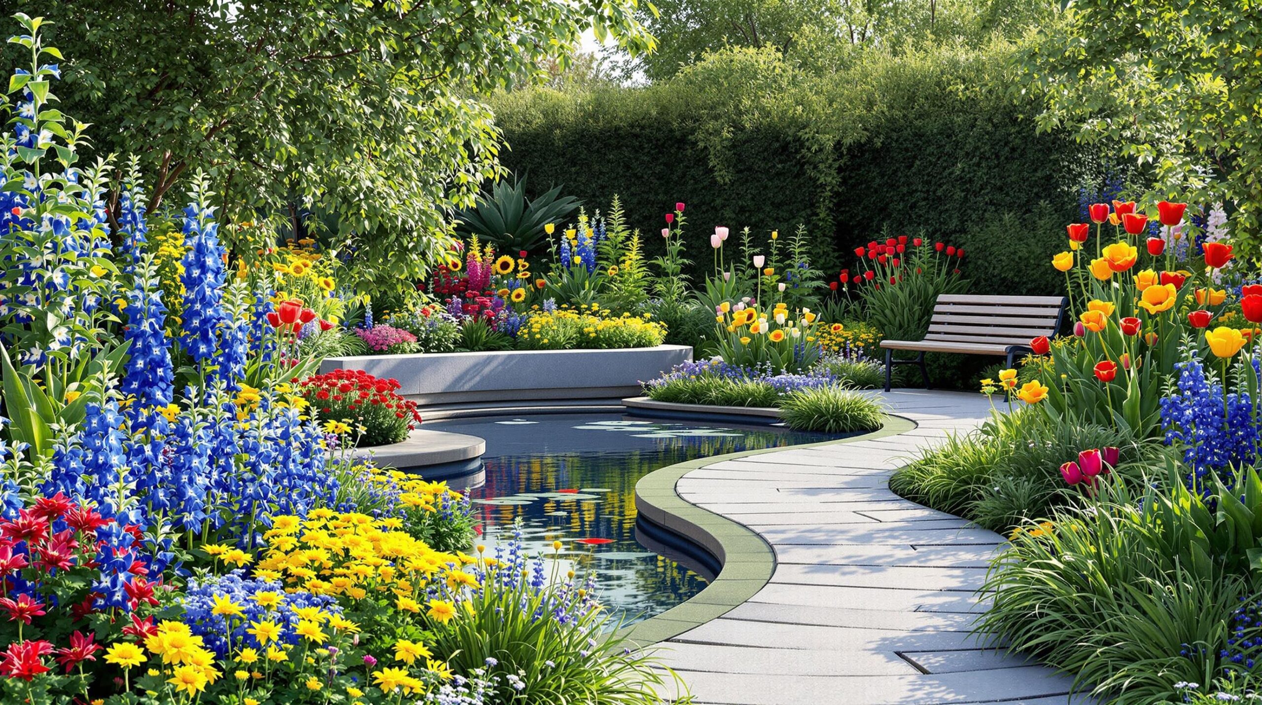
As gardens evolve into extensions of our living spaces, understanding the nuances of color theory becomes increasingly vital. It’s not merely about selecting plants based on preference; it involves crafting a visual narrative that speaks to the emotions and aesthetics of those who experience it. In 2025, we see a pronounced shift towards gardens that reflect our personalities and embrace harmonies of color, ultimately making outdoor spaces feel more integrated with modern home design.
This article delves into how to master color theory in garden design, from the basics of color interaction to advanced applications that can elevate any outdoor area. 🌿✨
Understanding the basics of color theory for modern gardens
At its core, color theory is about the relationships between colors and how they interact within a space. To create a stunning garden, one must first understand the primary, secondary, and tertiary colors. The three primary colors—red, blue, and yellow—form the foundation for all other hues. Mixing these primary colors will yield secondary colors such as green (blue + yellow) and orange (yellow + red), while tertiary colors arise from mixing primary and secondary shades.
| Color Category | Examples |
|---|---|
| Primary Colors | Red, Blue, Yellow |
| Secondary Colors | Green, Orange, Purple |
| Tertiary Colors | Red-Orange, Yellow-Green |
Recognizing these relationships not only helps with plant selection but also fosters a deeper understanding of how to create depth and interest in garden beds. For instance, the lively mix of red and green can evoke a warm, inviting atmosphere, while the balance of blue and yellow can suggest tranquility and brightness.
The color wheel: your planning tool
The color wheel serves as a fundamental resource for garden design. It illustrates how colors correlate and can be grouped into complementary (opposite) and analogous (adjacent) schemes. Utilizing color combinations thoughtfully can transform any outdoor space into a harmonious environment. 🌈
For example, complementary colors, like purple and yellow, dramatically enhance visual appeal when placed side-by-side. This contrast can be used to attract attention to specific focal points, such as a stunning vase or a water feature, while analogously colored plants like blues and purples can create a gentle flow throughout a garden.
Creating harmony with complementary color schemes
Complementary colors, positioned opposite each other on the color wheel, work together to create striking visual interest. By thoughtfully pairing shades like red and green or blue and orange, one can achieve maximum vibrancy that draws the eye in and captivates those who wander through the space. 🌼🔥
An effective strategy is to let one color dominate around 70% of the area, using the complementary color as an accent. This balance ensures the design doesn’t overwhelm but provides dynamic contrast that elevates the garden’s features. For instance, pairing bold red impatience flowers with green ferns creates a high-impact display, while surrounding them with white or neutral tones can soften the overall look.
| Complementary Pairing | Visual Impact |
|---|---|
| Purple & Yellow | Striking contrast, energy |
| Red & Green | Festive, inviting |
| Blue & Orange | Vibrant, cheerful |
Implementing analogous color palettes for flow
Analogous color schemes are composed of colors adjacent on the color wheel, promoting a natural cohesion that feels comfortable and fluid. By focusing on a predominant color—approximately 60%—and then supporting it with secondary hues at 30% and an accent color at 10%, gardeners can achieve a balanced and pleasing aesthetic. 🌻
Consider a garden with a yellow-orange-red palette where black-eyed Susans and coreopsis flourish alongside vibrant zinnias. This warm color scheme not only embodies a sunset-like appeal but also enhances the mood of relaxation and joy, making it perfect for social areas.
For cooler atmospheres, opt for blue-green-purple combinations featuring hostas and blue fescue, providing tranquility. This strategy aligns beautifully with current trends from brands like Pantone and Benjamin Moore, reflecting the desire for harmony in design.
Top tips for small garden design: maximizing space in 2025
Seasonal color planning for year-round interest
Planning for color throughout the seasons is crucial for maintaining visual impact. The simple beauty of spring bulbs is a great starting point, boasting vibrant colors that jumpstart seasonal displays. 🤩🌷
Transition into summer with long-blooming perennials and annuals like coneflowers and black-eyed Susans. This layering ensures consistency in color and provides various visual focal points as different plants take center stage throughout the growing season.
Fall and winter color considerations
Even in cooler months, it’s essential to plan for color. Selecting plants that offer visual interest through autumn foliage, such as oakleaf hydrangeas, can deliver dramatic displays as leaves transition to their vibrant reds and oranges. For winter, consider evergreen plants with varied foliage and structures to maintain visual appeal. This understanding reinforces the importance of cohesive design while leveraging insights from brands like Sherwin-Williams and Behr. ❄️🌳
| Season | Color Focus |
|---|---|
| Spring | Bulbs (blue hyacinths, daffodils) |
| Summer | Perennials and annuals (black-eyed Susans, zinnias) |
| Fall | Autumn foliage (oakleaf hydrangeas) |
| Winter | Evergreens and architectural plants |
Balancing color with form and texture
As you explore the emotional impacts of colors, consider the forms your plants take. Striking a balance between bold colors and appropriate structural forms will lead to a more harmonious outcome. For example, combining vibrant salvias with the geometric structure of ornamental grasses can create striking visual stability. This contrast is key to avoiding chaos in your garden spaces. 🌺✨
Specific brands like Farrow & Ball and Valspar produce paint that can be matched to outdoor elements, creating a cohesive extension of your indoor aesthetics. Using colors across various forms and textures enriches the experience of your garden. By surprising the senses with tactile variations like smooth versus coarse or fine versus bold, your outdoor areas will feel alive and inviting.
Frequently asked questions
What role does color theory play in garden design?
Color theory plays a critical role by helping designers understand how colors interact, which can guide planting decisions and create specific emotional impacts in outdoor spaces.
How can I use complementary colors in my garden?
Choose colors opposite each other on the color wheel and balance them thoughtfully. For example, pairing purple plants with yellow foliage can create a vibrant focal point, enhancing overall visual appeal.
What are analogous color schemes?
Analogous color schemes are created using colors adjacent on the color wheel, promoting smooth transitions in your garden. Aim for a dominant color at 60%, supporting colors at 30%, and an accent at 10%.
How should I plan for seasonal color in my garden?
Plan by selecting plants that bloom at different times of the year, starting with spring bulbs and transitioning through perennials and evergreens to ensure year-round visual interest.
How do I balance color and form in my garden design?
Match bold colors with stable forms to create visual harmony. Using a mix of textures, heights, and structures will give your garden depth and an inviting feel.